Hello. It’s Friday. Thanks for signing up. I’m Brent Donnelly.
The About Page for Friday Speedrun is here.
Here’s what you need to know about markets and macro this week
AD
am/FX is my daily macro note that goes to a couple of thousand traders and investors. Learn more, faster. Subscribe here.
END OF AD
Global Macro
We’re stuck in the washing machine as there is just enough good news for the bulls and just enough bad news for the bears. The debate on the economy right now is stuck in neutral as all the forward-looking stuff is screaming “Eek!” while the coincident data looks more like muddlin’ through.
There are two types of data: Hard and soft. Hard data tells you what is actually happening in the real world while soft data is generally collected via surveys of consumers and business leaders. The way things work, usually, is that the soft data leads and tells you where the hard data is going. Sentiment rises or falls before spending patterns change.
Imagine you’re a CEO of a major chip manufacturer. That is, your company makes and sells potato chips. For the first time since COVID, you are getting a bit nervous about the economy. The premium chip brands are losing share to the budget brands and that’s always a sign that consumers are running out of cash. Do you shut down one of your five factories right away? Just in case? No. It’s expensive and risky to fire people. So your waning optimism will show up in a survey, but not in the hard data on employment.
But three months later, if you continue to feel more and more pessimistic, you will start making plans for layoffs. By month six, you’re like: OK, sales are falling, the outlook is grim, let’s shut down the factory in Peoria and see how this plays out. Your sentiment soured six months ago but the hard decisions that show up in the hard data don’t happen for months.
That’s why you will see macro people put out charts like this all the time:
That chart (from ING) is typical of how people show soft data leading hard data. Note (for example) how the orange and gray lines move before the blue line on the rebound in 2009. Same deal in 2016 where the orange line showed the way lower.
And under the hood of those surveys, you can look at the components to get even more forward-looking information. For example, in the ISM survey, they ask not just “How you doing?” but “How are things looking on the order book going forward?” Responses to the second question are used to create a sub-index called ISM New Orders, and that sub-index is even more of a lead indicator than the overall survey.
Thing is though, sometimes the soft data turns weak and the hard data doesn’t follow. For example, there’s a University of Michigan consumer survey that used to be a pretty good lead indicator for the economy. But here’s what it looks like over the past few years. Note the economy was en fuego for most of 2021/2022 and yet the Michigan chart looks like this:
Michigan Consumer Sentiment Survey, 2010 to now
Turns out, consumers get sad when inflation explodes higher and this malaise is reflected in low survey scores. Consumers are annoyed and angry, but they are still fully employed and spending like daughters of an oligarch. So the economy was fine in 2021/2022 even as Michigan Consumer Sentiment went cliff diving.
It’s nuanced. The questions in the Michigan survey are heavily weighted to inflation so it was a particularly useless index in this cycle.
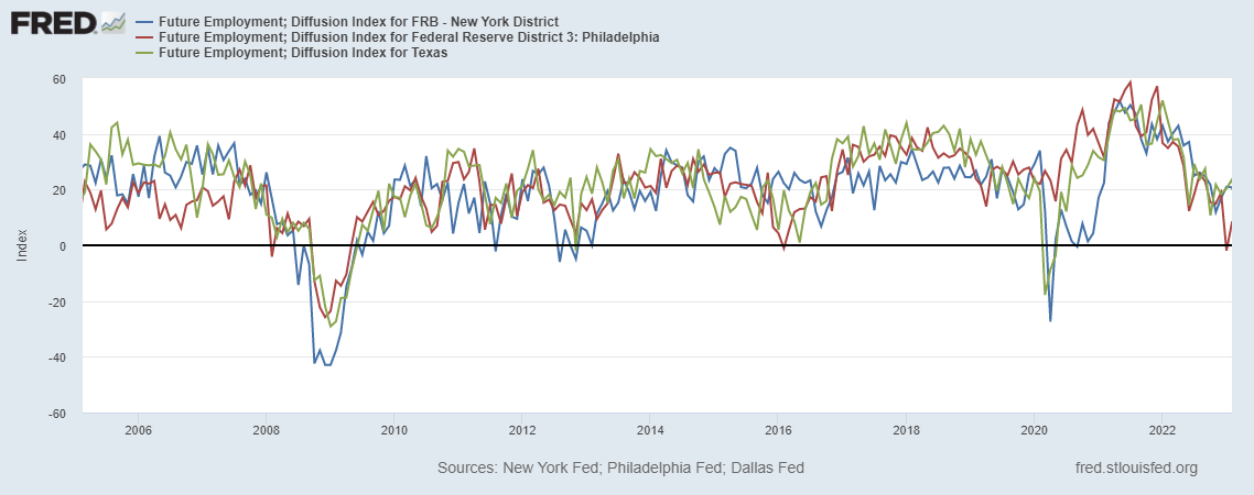
Anyway, the soft data like ISM New Orders, regional business surveys, lending surveys, and the NFIB business survey have been showing signs of weakness for a while, but the hard data like US Unemployment continue to show evidence of a strong US labor market. Here are the regional employment surveys, as an example:
That must mean the labor market has rolled over right?
Right?
The US Unemployment Rate hasn’t been this low since the US was fighting the Viet Cong
My assumption, and pretty much everyone else’s assumption remains that the US economy is going to crack. But there are these long and variable lags that play out in three steps:
Fed tightens
Soft data weakens
Hard data weakens
The lags between each phase can be as long as 12-18 months. Eighteen months is a lifetime if you’re a trader sitting there max long bonds waiting for the dominoes to fall. Part of being a good trader or forecaster is to know it when you see it. There is a high probability that tighter lending standards and falling sentiment will lead to slower growth in the US. But when?
Lending standards are tightening but the economy hasn’t felt the pinch yet
In trading and investing, early is often a synonym for wrong because you can’t hold on to trades or ideas forever. At some point, you run out of mental or financial capital.
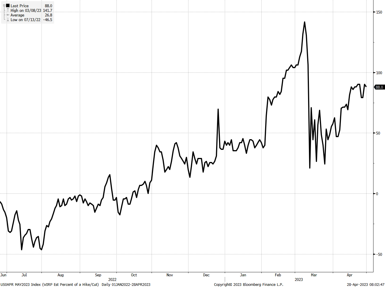
Next week is huge for macro as we get two ISMs, FOMC, and NFP plus the ECB, RBA and jobs reports in NZ and Canada. The next chart shows the evolution of pricing for next week’s Fed meeting.
The chart shows the market-implied probability of a 0.25% rate hike (0.25% is usually referred to as 25 basis points or 25bps — A basis point is 1/100 of 1%).
You can see the market expected a there could be a hike larger than 25bps for a while, but then after Silicon Valley went tango uniform, the market ratcheted towards no hike. Now, we’re back to an 88% chance of a 25bp hike.
Market implied probability of a 0.25% Fed hike at the May 3 meeting
Stocks
Stocks are flat on the week. They did a big U-formation and are right back where they started (4150).
Meanwhile, the AI frenzy is real.
Of course I understand that AI is huge and it’s the fourth industrial revolution and GPT4 is not even half as good as GPT5 is going to be and so on. AI is absolutely huge—exponentially more important than crypto or blockchain will ever be. That is almost certainly true in the long run.
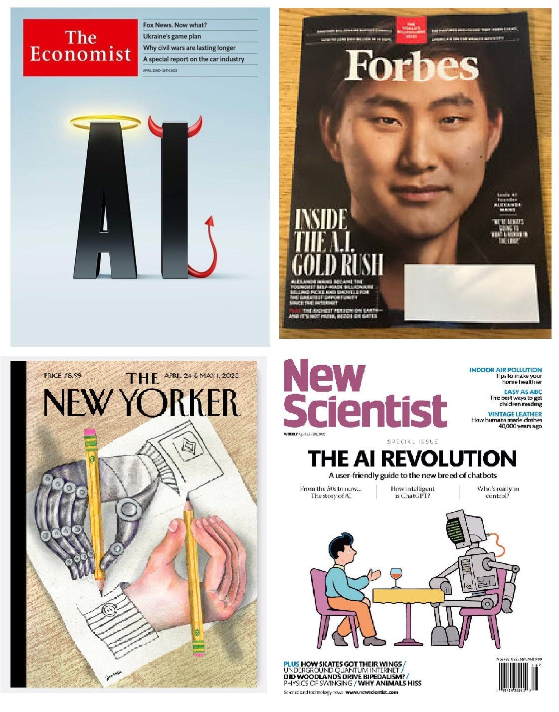
In the short run… These are all magazine covers in the past few weeks. Remember what I said a few weeks ago: Good stories and good stocks are not always the same thing.
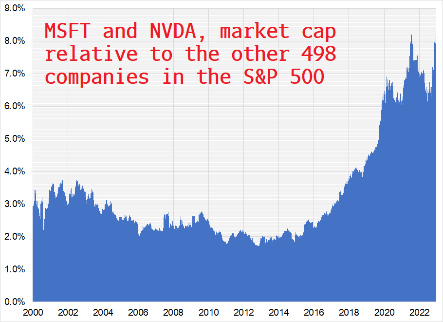
MSFT and NVDA are viewed as two large beneficiaries of the AI revolution. Those two stocks now account for >8% of the entire S&P 500. Their share was less than 3% in 2018. No matter how good the story, extreme dominance of a few companies in an index can be an indicator of excess. Trees do not grow to the sky. So while I fully grok the AI story, I’d be scared of longs in MSFT or NVDA or AIQ from here as the story is very well-subscribed and could be fully priced for now.
You go broke reflexively selling anything that has rallied a lot. That is a stupid strategy. On the other hand, taking profits in positions when your favorite theme is blaring from the front cover of every magazine in the world is rational.
There’s a cliché on Wall Street: “If it’s in the news, it’s in the price.” The real money is made by those who have unique views that are not obvious to everyone else in the world. Doing the obvious thing can work, but doing the obvious thing at nosebleed levels can be enormously costly. We now have AI on four magazines and Tim Cook on the cover of GQ, all in the space of a few weeks. You have been warned.
Further reading on why magazine covers are often reverse indicators.
Bonds
Sometimes the market hops on a narrative and rides it all year like the Everything Bubble of 2021. Sometimes, like this year, the market is walking around at 4 a.m. with the lights off, drunk on tequila and smelling like cigarettes.
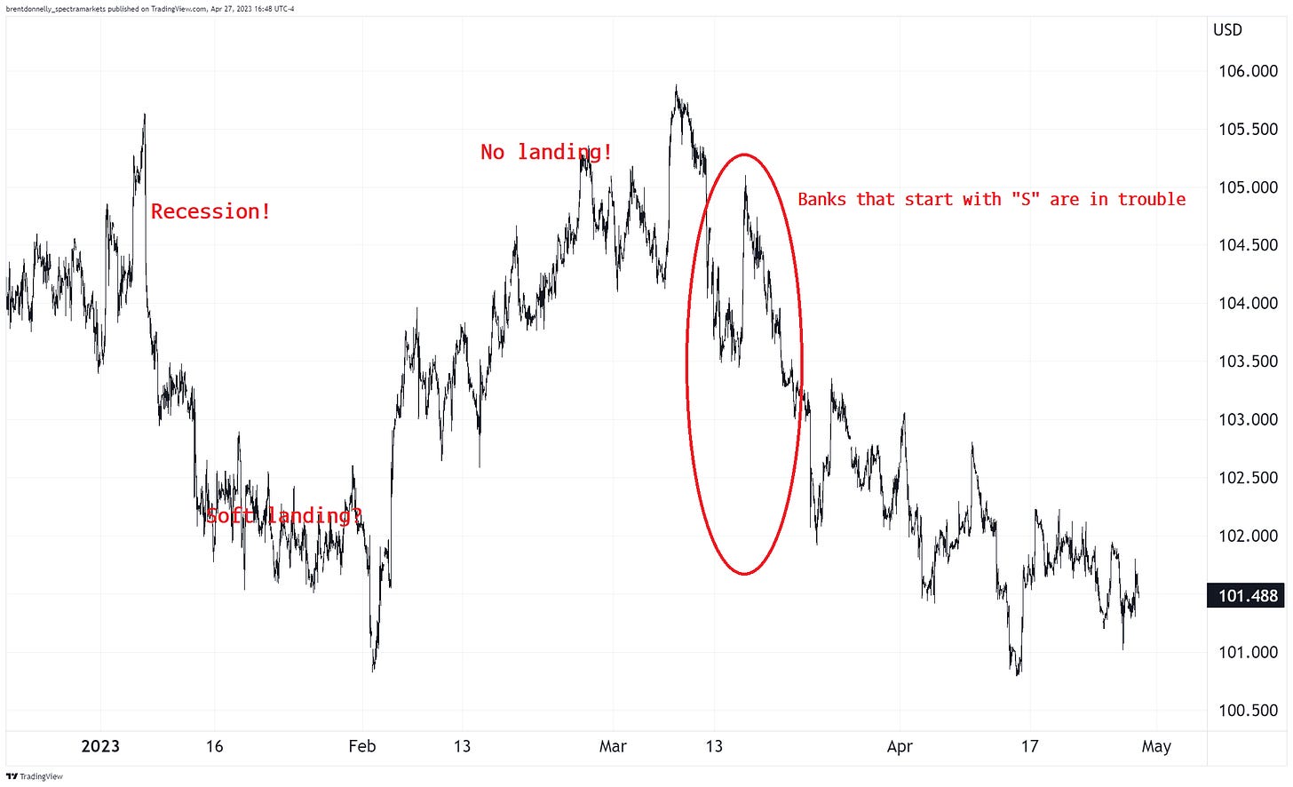
Check out the next chart. We opened the year with recession fears taking yields lower. Then, soft landing vibes kicked in. Then it was like: No landing! America!
Then the banks that start with “S” got in trouble.
US 10-year yield in 2023
Post-mini-banking crisis, US 10-year yields have settled into a 3.30%/3.70% range (approx). With so much economic badness on the horizon, my view has been (and remains) that we will hold the top of the range and yields will go lower into the second half of 2023. We shall see.
Those horizontal lines I drew are to show you the equilibrium zone that has ruled the bond market post-Silvergate and my expectation after almost two months in that range is that we will need real, meaningful news to break out of it. That real, meaningful news will probably be weak US economic data.
Fiat Currencies
When non-FX people think about currencies, they usually think about their home currency or the US dollar. Those are the two currencies that usually matter most to you unless you live in Calgary and you’re going to Phuket then you might have to rate check CAD/THB a few times before you go.
The dollar matters to everyone because:
It’s the global reserve currency.
It’s a reflection of monetary policy direction in the USA and US monetary policy influences financial conditions all over the world. Tighter Fed policy = higher USD, usually. Not always.
Most global commodities are priced in USD. This creates a bit of a reflexive relationship where commodities tend to move inversely to the dollar. I.e., USD down = gold up, and vice versa. But not always.
American conglomerates earn revenue in foreign currencies but report their earnings in USD. A weaker USD is good for earnings. Every time MSFT sells an XBOX in France, they get a fistful of euros. If the USD weakens before MSFT sells its euros, MSFT’s earnings in USD terms go up. US multinationals don’t hedge their revenues in real-time (generally) so a weaker USD is good for US earnings.
Here’s what the dollar has done this year:
US Dollar Index in 2023
Notice how that chart of the USD looks a lot like the chart of yields I showed a bit earlier? The dollar has been inextricably linked to US yields this year. The main driver of the dollar has been US economic performance and Fed policy expectations. Whatever yields do, that’s what the dollar is doing these days. That is not always the way the USD works, but that’s how it works right now.
Crypto
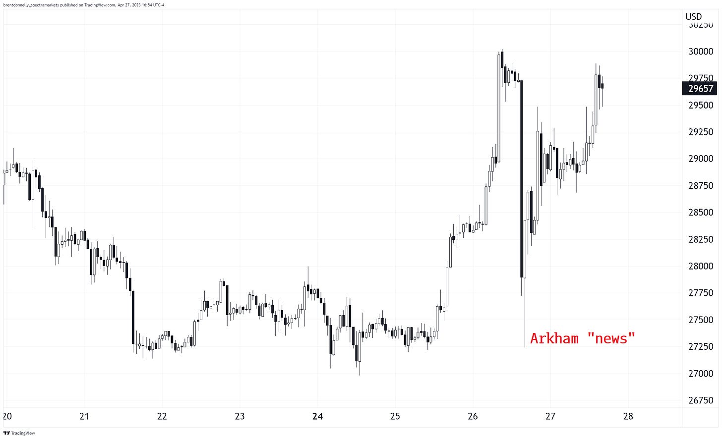
There was a flash crash of sorts in crypto this week as an analytics firm tweeted some confusing but ultimately fake news about movements of money from old Mt. Gox wallets. Mt. Gox was the dominant crypto exchange back in the olden days (2013). When it went bankrupt, some assets were frozen. At some point, there will be some chunky bitcoin for them to sell when they are ready to repay creditors. Even a whiff of Mt. Gox activity can be heart-pounding for crypto markets.
False alarm, for now. Presumably, the Mt. Gox administrator isn’t just gonna unleash a firehose of BTC on the market, so the whole thing seems overblown to me, but whatever.
We interrupt this relentless bitcoin rally for a bit of fake news
Even with the Arkham weirdness, the NASDAQ and BTC continue to share the lead as the hottest assets of 2023. Neither has traded below its 2023 opening price and they are both up substantially as 2022’s biggest losers are 2023’s biggest winners.
Commodities
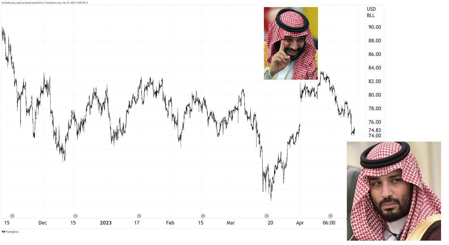
Oh, oil.
OPEC flipped the bird to Biden with oil at $74 and it quickly ripped to $83. It’s now trading at … $74.
In poker terms, OPEC had AK vs. Biden’s AQ and the flop came Q57. Let’s wait and see what the turn and the river look like.
Alright. That was 6.7 minutes. You’re done.
Get rich or have fun trying.
Links of the week
Interesting
Why actual trees don’t grow to the actual sky.
True / not good
Sports betting is the new Oxycontin.
True / not good
The attention economy and the outrage machine called social media have pushed nuanced language to the periphery. “Bad” and “horrible” do not mean the exact same thing. Words have meaning.
See this thread from UNC Professor Tressie McMillan Cottom (via Kyla Scanlon). Here’s an excerpt:
I ask people sometimes if they think bad and horrible (for a silly example) connote the same emotional state. They say yes.
If you think bad = horrible, I can see how discomfort = injury in your mind. We know language structures our world. If you only have two categories of words, you may only be able to have two categories of experiences. Which is so sad that I might cry. brb
Sketchy AI
Smart / educational
Ray Dalio’s latest on where we are in the big cycle. Dalio must have some sweet kind of endorsement deal with LinkedIn.





Thank you
Thanks for the explanatory background color on hard/soft data, now can finally distinguish!